There are a lot of writers and business- minded people who have put up their sites with specific goals that have not been met. This is an opportune time for you to conduct tests and experiments to see which areas of your pages and sites could do with more improvement, and which ones you should keep the way it is. Now, if you were never too fond of science like me, hearing the words test and experiment are enough to make you want to do something else. But it’s important so you’re still here trying to see how long you can stay attentive.
When I first started reading about Visual Website Optimizer (VWO), I was super hesitant about it. I don’t have a lot of technical experience, and science just bums me out. But if something claims to be the World’s Easiest A/B and Split Testing Software, you feel more open to trying it out.
And was it really easy?
Let’s just say it made me feel like a pro who could turn their whole business around.
VWO will help you run several different tests. You’ll find each test on the dashboard as well as various tools for analytics.

A/B Testing
Okay, first of all, Google offers a free tool called Google Content Experiments. And while it’s Google, and it’s free, it’s isn’t the same thing. Which is why paying for VWO to do this type of test isn’t some idiotic purchase.
A/B Testing is a basic feature that’s found in all conversion testing tools. Select that, type in your URL and click Create Test. They also list down your top three most used sites for you to choose from instead of just typing it in. So after that, a page telling you that their hamster-powered servers are fetching your page pops up. Those good old hamsters get the job done, and you get a display of the site you chose.
You start of being in design mode, and you can quickly click around and make changes to your page. Hover over a specific item and options to change it will pop up. You can see how a normal visitor would view your site using browser mode. Switch from one mode to another and make as many changes as you see fit. You can even make variations to mobile and tablet display, depending on the type of plan you get.
Once you’re satisfied, click Next Step and create a conversion goal. You can add or delete several goals, but one of them has to be assigned as the primary. After you do this, you can move on to step 5, and add details such as test name, hypothesis, and conversion rate goals, test URLs, traffic segments, and more. There are advanced options available for you in Other Settings.
Conducting this test was easy. I understood what to do quickly, and it was fun.
Multivariate Testing
This test type lets you test all the different elements on one particular page. The first couple of steps is just like the first test. On step 3, though, you can start customizing an infinite number of page elements. For every element created, a new section is put in your list of variations and controls. If you’re more comfortable with applying one via CSS or Javascript, you can do that, too.
The rest of the steps are like A/B testing, and like it, I didn’t have trouble understanding and going through the process, neither.
Split URL Testing
Send traffic to two different URLs of one landing page. This was one of the fastest ones I created. Just enter the URL of your control page and then the URLs of competing pages. It’s a great way to test conversion for when you make a huge design change.
Visual Campaign Builder
VWO offers a point and clicks interface for you to create your tests and other campaigns. All you have to do is load the website and just starting pointing and clicking away. You can do and undo changes as much as you’d like, too. There’s no coding because, like it says, it’s all visual. But if you have technical experience, or have an IT team, you can make changes to the code using JavaScript, HTML, CSS, and jQuery. Aside from experimenting with different test types and campaigns, you can also experiment with the actual look of your website.
Data and Insights

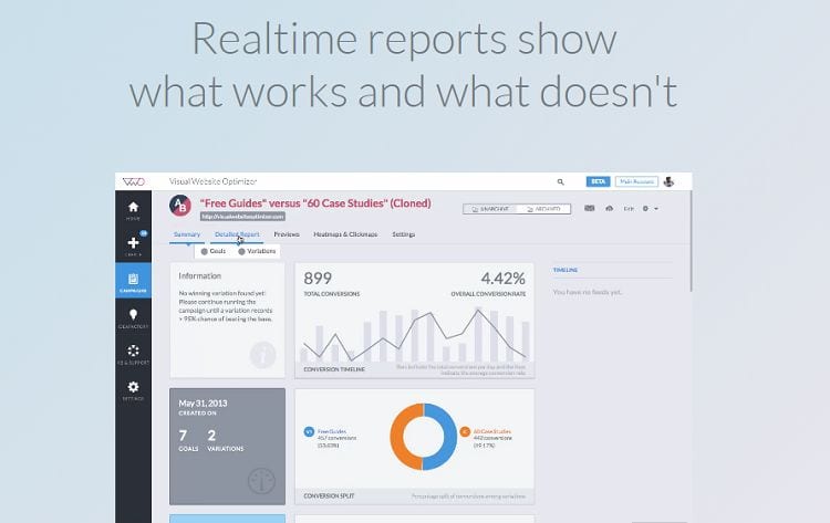
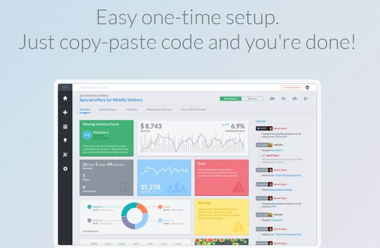
You get comprehensive reports for all the campaigns that you’ve run. These reports let you know how your designs are performing versus the goals you’ve chosen to track. There are charts and graphs on display for you to review and compare to other designs and get insights on which one is performing the best. You can share these reports with your colleagues or clients. They have reports that also give you your total revenue based on the designs that you’ve come up with, as well as customizable segmentation to find out results for different segments of visitors to discover maximum conversions.
Visualize Visitor Behavior
Another handy tool that helps me understand and see visitors’ behavior is the heat map and click analytics tools. The heat map gives you a visual representation of the areas where the visitors click and browse through. This helps you see whether or not they’re clicking the things you want them to be clicking and if there are elements in your page that distract them from doing what you want them to do.
Click analytics give you a report of the elements in your page that visitors click and how many times. It’s a handy way for you to see which areas visitors see or take notice of automatically, and which ones are being ignored. You could have a really important element you want them to notice, but visitors don’t see it, after all.
Geo and Behavioral Targeting
Behavioral targeting studies how different visitors behave towards different types of campaigns, content, and offers. It sounds like a lot of work and some technical processes. It took me a while to do something about this one just because of what it sounded like. Again, I was mistaken.
You can come up with content on their visual editor and then target it to a specific type of visitors who search certain keywords and where they’re from. This opens up a world of possibilities like targeting different promos to a certain segment of people, posting announcements or feedback about a certain product, service, or event and only posting those that are within somebody’s location, only displaying careers that apply to one’s area, and so much more. There’s so much you can do that it took me a while to figure out which one I wanted to do first.

Installation is easy. Put the JavaScript code snippet on your site and start creating campaigns on the VWO dashboard. You go live in less than a day and create sub- accounts if you have a team and need them for collaboration. If you need assistance, they have 24/7 support as well as onboarding and training. You can also get inspiration and additional learning from users, their case study library, IdeaFactoy, and their Landing Page Analyzer. The software works well for desktop websites as well as mobiles and tablets. And in just one click, you can install and integrate it with your favorite analytics, CMS, and shopping cart tools.
VWO has three plans: Standard, Business, and Enterprise. The Standard Plan costs $49 a month if billed annually, or $59 per month. For $129 a month billed annually, you can purchase their Business Plan. You can also get it for $155 per month. Contact them for their Enterprise Plan which starts at $999 per month. All the plans include unlimited domains, campaigns, and changes, as well as the basic testing and campaign options.


